Digital marketing is an evolving industry. What this means for many businesses is that brand identity trends flow wherever the marketing and advertising world leads them.
Change is constant and often happens in the blink of an eye. Today, we’re here to shine a light on the similarities and differences of brand identity trends between 2019 and 2020.
But first, let’s quickly remind ourselves what brand identity is. Simply put, it is all the visible elements of your brand from design, logo, and color that distinguish you in the consumers’ minds.
2019 Trends
All things vintage
This trend always comes back. It’s called vintage for a reason. We saw the rebirth of vintage branding in 2019. Back to a more traditional trend, we saw a resurgence in vintage branding, mostly seen on logos.
Vintage-inspired logos revolve on an image framed in a sign that would typically incorporate your company name and the year your brand was established.
Aesthetic of geometrics
Another big trend in 2019 is geometric branding, which includes abstract shapes and lines. This attracts brands with an aesthetic that revolves around structure and order with dash modernism.
Typically paired with deep and lively colors to balance to clean and cold aesthetics of geometric branding.
Negative space
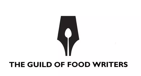
We saw a rise in brands adapting negative space in their logos. Many brands have creatively used empty spaces to elevate their brand identity.
Photo via The Guild of Food Writers
Organizations like the Guild of Food Writers developed a logo that cleverly uses negative space to create a memorable logo that clearly defines their purpose.
2020 Trends
Simplicity
Minimalism is a steady trend that many designers lean in when it comes to showing a client’s identity. Big companies like Nike have used the same logo for the last three decades, and its design is still very relevant.
Motion graphics
This 2020 brand identity trend opens new possibilities for attracting consumers. Living in a social media world, animating your logo to be posted and shared on Instagram creates dynamic ways your brand can engage your followers.
Reimagining brand values
We’re at a point in history where people are now standing up against traditional stereotypes. Illustrators and designers are discovering new ways to express a brand’s values. Consumers are responding positively to modern concepts of reimagined brand logo.
Hand-drawn illustrations
These are charming and captivating to look at, especially on our devices. High-quality hand-drawn illustrations are quirky, expressive, and work well with geometrics and negative space.

Negative space is here to stay
The use of empty space is carried over into 2020. Its minimalistic and simplistic philosophy makes it a transcending trend that can go for ages.
Looking to improve your brand identity? It’s never too early or too late to start thinking of your brand identity. If you don’t know where to begin, your first step is to acknowledge that you want a fresh start. Your next step is to send us a message, and from there, we’ll work together to come up with an inspiring and engaging brand identity.


Leave a Comment
Comments (0)