Psychology in design is essential to a brand’s success, but we don’t think of this all the time because our brains are preoccupied with family, work, and life.
And given that we’re still in the middle of a pandemic, nobody is really examining the fact that learning psychology in design is beneficial to a brand when it comes to knowing their audience.
While design can be mainly considered an artistic venture, there’s a lot of science behind it, especially when relating to an audience.
What is design psychology?
Simply put, it is the habit of incorporating human psychology when it comes to making design decisions consumers will surely understand, remember, and love.
What is the role of psychology in design?
As a visual language, design is a vital form of communication. But for it to effectively work, there needs to be a thoughtful analysis of the consumer psyche.
Understanding how we behave, what we aspire, and what motivates us are crucial questions that need to be answered. You might just hit the jackpot on your next campaign!
Knowing human psychology allows brands to craft projects that are intuitive and purposeful to users.
But designers don’t need a Ph.D. to implement psychology to their work.
Here are important psychological principles to take in mind for your next campaign.
Hick’s law
This law states that people’s decision-making increases as their options increase. It’s a little obvious, but it’s a proven fact.

Let’s compare our trips to Cheesecake Factory and a food truck. At a Cheesecake Factory, we flip through pages and pages of food options. In contrast, at a food truck, our selection is limited, usually to a small blackboard.
The result? We tend to order faster at a place with fewer options. This theory goes for design as well.
How do you apply Hick’s law into designing a website? Users visit your site for ONE reason. So, keep your web design simple and tidy by eliminating unnecessary text, CTAs, links, and images. Let them see what they came for quickly.
Gestalt principles
Our works in mysterious ways. Gestalt theory, aka the laws of proximity, symmetry, similarity, and closure, teaches us that people subconsciously segment objects to perceive them as one-whole.
Simply speaking, Unilever’s logo concisely represents the Gestalt theory. It contains distinct objects but is seen as a single unit that forms the letter “U.”

For a more in-depth study of this design principle, read more here.
Fitts’ law
This law predicts human movement in the field of human-computer communication. Fitts’ law hints at intuitively placing buttons or making it more significant to reduce interaction time.
In the world of web design, this means that this improves a company’s conversion rate by lessening the time a potential consumer’s dragging the mouse to click on a CTA button.
Increasing the link size when you hover the cursor over certain items is a strategy to rapidly help users move from one activity to another.
Psychology of persuasion
Persuading others is more than a business motto. There’s a science to it that helps augment the growth of a brand. For the most part, potential customers need a little push before acting on a desire.

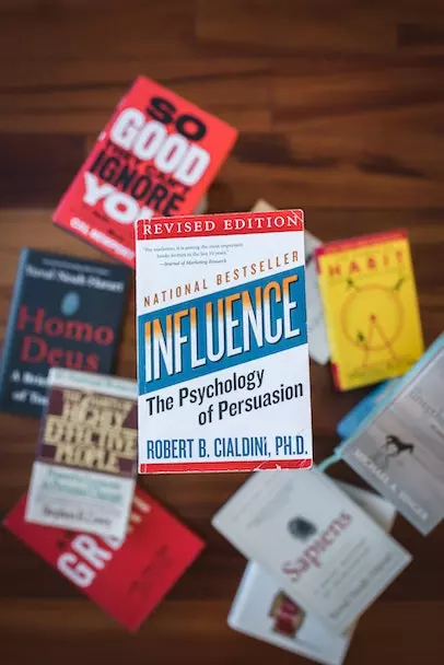
In “Influence: The Psychology of Persuasion,” Dr. Robert Cialdini devised principles of influence:
Authority
People tend to obey experts and authoritative figures because they are seen as trustworthy. Viewing titles such as CEO, Dr., or other high-ranking authority appeals to consumers and helps a business succeed.
Liking
Consumers tend to follow friends, family, and now influencers that share similar interests and opinions. Social media is the best platform to see and experience how the psychology of persuasion works.
Social proof
Have you checked Amazon lately? Notice how after you clicked on that rollerblade you’ve wanted to buy, you see a suggestion “Customers Who Bought This Item Also Bought?” Websites use social proof such as reviews and recommendations to steer you in decision-making.
Psychology of shapes
Our brains correlate shapes to represent an idea or command.

Take, for instance, the “stop” sign. The octagon is a globally recognized shape that tells commuters and drivers to yield.
For many brands, shapes are paired with colors to evoke an emotional connection between them and their target audience.
Squares and triangles
Straight-edged shapes suggest strength, power, stability, and professionalism.
Circles, ovals, and ellipses
These shapes promote positivity, community, infinity, and unity.
Vertical lines
These lines on logos are linked to masculinity and strength.
Horizontal lines
These lines are known to conjure equality, community, and tranquility.
Psychology of colors
Colors affect how humans react and behave. Specific colors elicit emotions.

When implemented correctly, color psychology is influential when it comes to your brand identity.
Take a look at the characteristics each color brings.
Blue
We see this mostly in the corporate world to convey companies as trustworthy. Facebook’s blue color suggests that the social networking site secure.
Red
Coca-Cola has stuck with their classic red to express passion, action, and excitement as a brand.
Yellow
This color elevates positivity and optimism.
Multi-color
Companies with several colors, like Google, hints that they offer an array of products and services.
Read our blog on psychology of color in marketing to learn more.
Incorporating psychology into your design strengthens your brand’s connection with your consumers. Having a firm knowledge of how design is viewed and taken by users is vital to your company’s growth and success.
It may look like a complicated task to accomplish, but that’s why we’re here for businesses like you. The use of psychology in design is a timeless strategy for growth and success.
We’ve followed these steps and have helped over 200 companies around the world. From construction companies to health and beauty apps and social media influencers, we practice what we preach.
Send us a message to find out what we can do to improve your web design.
Find out more about the work we do.


Leave a Comment
Comments (0)