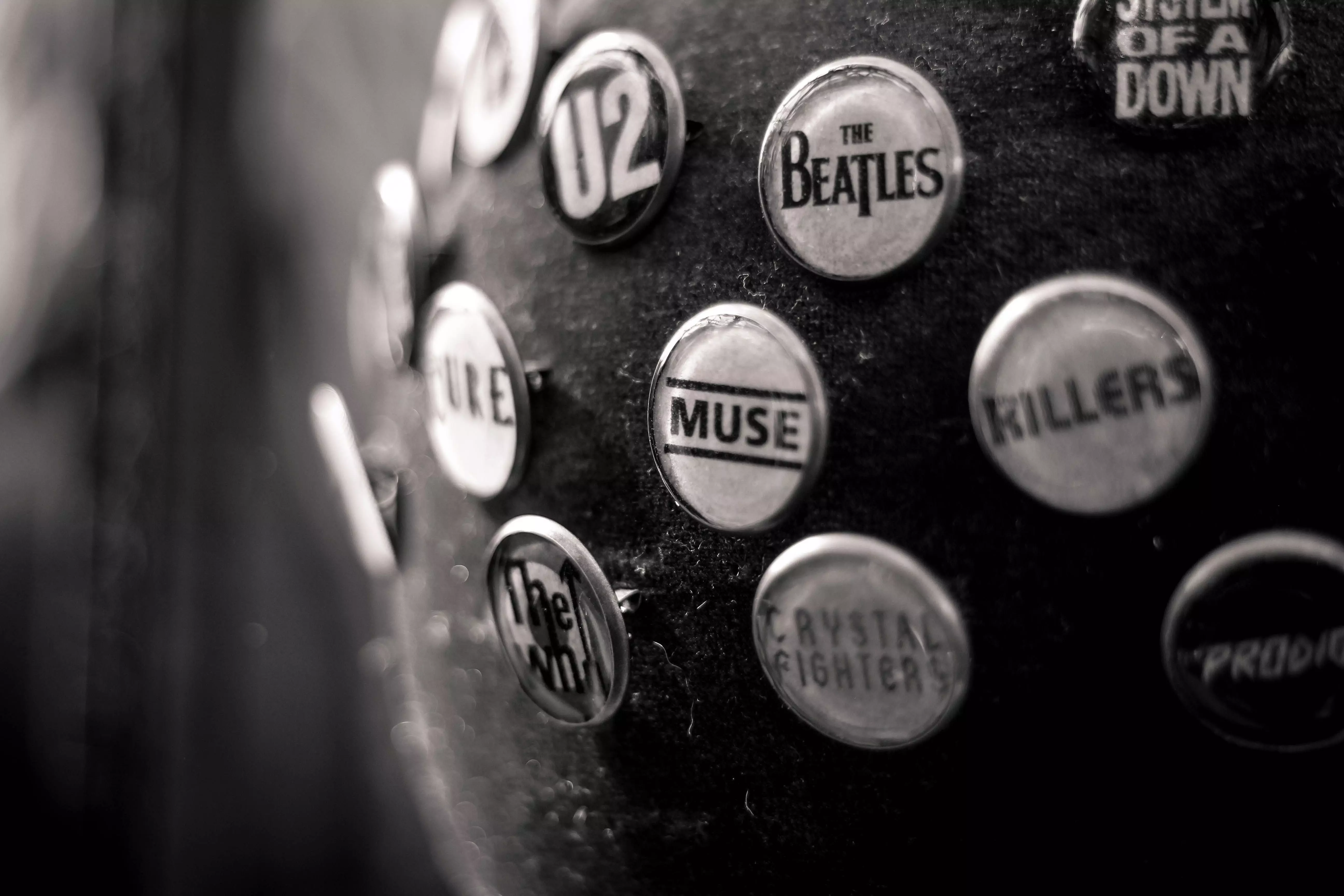
We see it every day. We interact with it in different ways. We don’t pay much attention to it, but to those who understand it knows it really, really works.
Typography is like science for the creative class. It’s an essential part of design, content creation, and consumer engagement.
From books, newspapers, to magazines, typography plays an important role when it comes to telling a story or delivering a message to its readers. With a wide range of typefaces and fonts to choose from, content creators find new ways to communicate effectively.

What is Typography?
Typography is the playful science and serious art form of organizing type to have better readability and character when displayed. This process involves choosing a typeface, defining point sizes, line-spacing, letter-spacing, and kerning.
For the most part, creatives that work on typography are graphic designers, comic book artists, art directors, and social media specialists. But with the proliferation of the digital age, people with a smartphone or a computer can play with typography. The result of this, however, may vary in comparison to a professional’s work.
Importance of Typography in Digital Marketing
People are now more visually aware than ever. Whether it’s reading a menu, looking at a banner, or watching an ad, knowing what typeface or font to use can seriously affect the consumers’ decision-making ability.
Here are 4 reasons why brands need typography.
Medium of communication
Brochures, websites, and flyers are typically a consumer’s first interaction with a brand. Proper placement of content, fonts used, and color selection can pave the way for brand engagement.
Attract the consumers and get their attention
Finding the right font is key to attracting consumers. Fonts build personality and add value to a brand. To hold a consumer’s attention, it is also important to highlight all the key elements or content that are fascinating. These could be facts, figures, or even witticisms.
Build a sense of harmony
Typography is about pattern and pattern creates harmony. Harmonious formatting provides consumers a feel of continuity which creates a clutter-free look that makes it easier for them to understand a brand’s message.
Create a sense of professionalism and recognition
Depending on what a brand needs, the correct typography is a reflection of a brand’s professionalism. Consumers remember a brand that has harmonic, logical, but creative design. It builds recognition and shows character.
How to Choose the Right Typeface
When deciding a brand’s typeface, remember there are – don’t get shocked – thousands of fonts to choose from. But one thing to be made sure of is to avoid knee-jerk reactions. Selecting the right font or typeface takes time, patience, and good set of eyes. Brainstorm on what personality or characteristic a brand needs to convey. It can be classy, fun, quirky, or casual. Make sure that the typeface and personality match so the overall design and message can shine through and reach its audience.
Ready to add value and personality to your brand? USA Link System is here to help with your brand’s typography. We’ll let you know whether Helvetica or Avenir is the font your brand needs.
On the next ULS blog, we’ll be answering the questions, “What makes a good logo?” and why brands need to hire professionals (cough, cough… us) for their logo design. Stay tuned!


Leave a Comment
Comments (0)